2.28.2007

i love grids too.


MAKING THE INVISIBLE VISIBLE
Whether we admit it or not, grids are an essential part of our life. Without grids, our lives would be messier, uglier, and more confusing places to live in. The Art of the Grid products will keep your life in order! Write your shopping lists, practice your layouts, and keep
your books and magazines on the shelves of grids that changed the history of design.


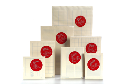
(above) grid-it notepads from astrid stravro. i found these via ace jet 170 and type for you... however, i may be missing something, because i can't find out where you can buy these. (if any knows, clue me in!) but it appears that the company of designers, miquelrius, is based out of barcelona. so maybe when i get to barcleona i can scope this out a little more. i think the concept is great and i can already think of over a hundred ways i can use these things. as a graphic designer i can totally relate to placing everything in grids, i do it mentally all the time.


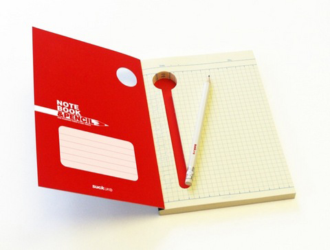
(above) i do know where you can find this notepad. it's for sale at www.shopmodi.com. i think the place for the pencil (or pen) is quite the clever idea. i found this via better living through design.

2.22.2007

ready, set, go!


in lieu of having just bought plane tickets to spain, i dedicate this post to... TRAVEL!

1. the moleskine city notebook allows you to keep track of your travels by making your own guidebook. it features metro maps, station index, zone maps and street index, 42 blank pages, 96 notched pages for your city file, 32 detachable sheets, 12 translucent sticky sheets to trace, and expandable inner pocket.

2. the F1 IDENTIFLYER TAG is a feature product from the [great] travel gear website Flight 001.

3. i am in love with this item, a graphic style clutch from Loop! perfect size for your plane tickets, passports, metro cards, and other travel documents. found on the kitschy site, fred flare. [pssst, locals! i also saw this clutch in five points' edge city... and i think it was tad bit cheaper too!]


4. this is an expand-a-bag! i can't think of a better thing to bring. toss it in your suitcase on the way there, and then carry it on your shoulder on the way back when it's full of all the goodies you bought that didn't fit in your luggage!

5 and 6. are a little tribute to the wonderful world of real film and lomography. first is the Lomographic Horizon Compact Panorama Camera, "Its glass swing-lens pans a full 120° from left to right as soon as you press the (exposure release) button. The Horizon image is then magnificently captured across an e-x-t-r-a-w-i-d-e 58mm of film - almost the width of two "normal" 35mm frames. Mind you, this is still using the standard, easy-to-find 35mm film that we all know and love. High resolution panoramic shots of people and space, skylines and broad vistas are captured seamlessly in striking clarity and regal colours." [accoring to adorama.] Second, we have the Lomo Super Sampler 4 Lens Panoramic 35mm Camera. I gave this camera to my sister for christmas, and it really is cool and fun! It captures 4 panoramic sequential images, all on one regular photo print.

7. F1 SAFETY MAKEUP BOX, another featured [and exclusive] item of flight001.com. it's your general toiletries bag, but printed in airplane safety graphics. how silly and neat!

2.20.2007

for the love of jacksonville

Panoramic Downtown_COLOR for web

EU, by policy, doesn't really publish a lot of political editorial. However, i WOULD like to shed some light to the great media coverage that is happening around town regarding our city, the way it is being planned and people doing something about it. with that said, i'd like to turn your attention over to some really interesting posts/articles:

1. The Case Against Roads was an entry Joey posted last Friday over at the Urban Jacksonville blog, it is an article that Michael Lewyn wrote in Folio about the increasing sprawl happening in Jacksonville. You can read the article, and maybe even more interestingly, the comments that follow (including one by our new city planning director, Brad Thoburn).

So if middle-class families move to outer suburbs, some Duval suburbs will simply be unable to compete; property values will flatten out, schools will deteriorate, and Duval’s suburbs will deteriorate just as older automobile-dependent areas around Beach Boulevard and Philips Highway deteriorated when faced with competition from newer, shinier areas such as Baymeadows and Southside. In short, sprawl is a revolution that eats its own children.


2. Metro Jacksonville posted Is Jacksonville Serious about helping Small Business Owners? yesterday.

Mark Hemphill’s two venues (Mark’s and Dive Bar) do extremely well on Friday and Saturday night, and Club TSI has a strong following, but a three block district has to be more than three places. The main reason downtown areas become vibrant has to do with connectivity, one place feeding off of another. Imagine going to the Avenues Mall, and seeing over half of the storefronts vacant – it wouldn’t work, and would collapse in little time. The Mark Hemphill’s are doing their part – will others follow?


.... so on top of all the issues raised in the above articles and comments... i have one (slightly off-topic) question, why in the world wasn't someone from the city knocking on the newly resided Art Institute of Jacksonville's doors and asking them to put their school in the heart of our city, downtown, rather than sticking it in another bland Beach Boulevard building? I mean look at what happened to downtown Savannah since SCAD got involved. I don't know, I'm speaking without having researched (maybe someone did ask them [AI] to come downtown), but I think that would have been ONE logical move to help get people downtown and staying downtown.

2.12.2007

romance.


Typeface: Mavis
For Like Ever design ©2004-2006 Village


i ordered this poster from village last thursday and it arrived in the mail today! (that's some of the fastest online processing i have ever seen!) checkout their website though, they showcase some really great typefaces. the poster has been featured in both domino and elle decor magazines and ever since i first spotted it, i've imagined it hanging in my little computer/work nook at home. this is what the village has to say about it:

"We are so thrilled that this poster has found such a kind and avid audience. It was designed in 2004 as a part of Tracy's MFA thesis project in the Graphic Design program at Yale University. It is a simple phrase she has always loved, and magnifying it on paper seems to change its meaning from a sometimes throwaway saying to a larger hopeful statement. Putting it down on paper was an attempt to make something fragile and fleeting permanent. Tracy hand screen-printed the first edition in grey ink in a very limited run with the help of a classmate. Last July, we decided to print the artwork in pink and red to celebrate the launch of the Village co-op. In a way it was meant to be a love letter to each other and a celebration of the exciting and scary prospect of a new beginning."


another romantic image, a room from david hicks. via decor 8.

2.09.2007

number one rule in journalism: always carry a steno pad and camera.

to fit my mood, here are some images i'm adding to my virtual steno pad.


works of interior designer Romain Michele-Meniere in the November-December 2006 Maison du Maroc. via My Marrakesh.


Jefferson Design Group via all the best.


amazing floor patterns by Brownstoner. via Lena.

LinkWithin

Related Posts Widget for Blogs by LinkWithin